Scitech is a household name in Western Australia. Scitech’s work over the past three decades has brought cutting edge science to everyone from adventure-ready kids to inquisitive adults – igniting a lifelong curiosity in the process. Recently Scitech decided it was time to take on a different kind of adventure: building a new website that ensured effective access for people with disability – with fantastic results. Here’s some insights into Scitech’s accessibility journey.
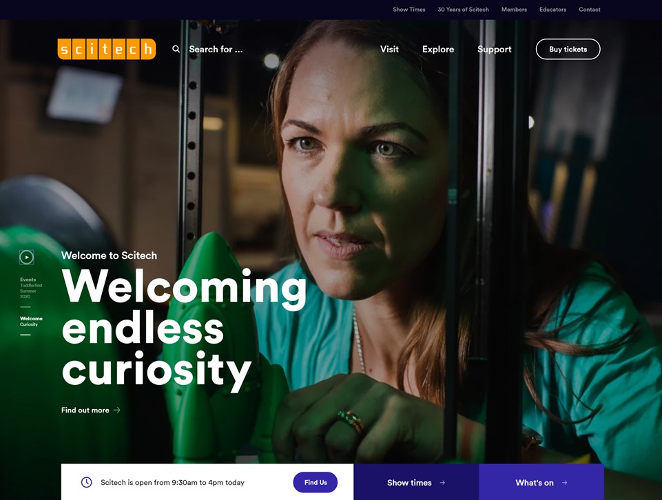
As the new website neared completion, a website assessment was conducted by the Centre For Accessibility Australia’s Dr Scott Hollier to determine its compliance to the W3C Web Content Accessibility Guidelines (WCAG) 2.1 Level AA standard. This involved testing with several automated accessibility tools and code validators, a variety of different assistive technologies including screen readers on desktop and mobile devices along with dictation software and several different browsers across Windows, Mac, iOS and Android.
Once the technologies and a baseline were determined, sample pages were identified for the testing. This included a range of pages based on typical content, multimedia content, event pages, interactive elements such as forms and date pickers, and the home page. Once the assessment was complete, it was found that overall, the Scitech website worked well in broad terms, but some accessibility issues needed to be addressed.
Video playback
One of the issues picked up in the testing was that the initial video playback
lacked controls. This included controls for fast forwarding and rewinding
videos and adjusting the volume. With the issue identified Scitech were able to replace the video plug-in with a more accessible video player, ensuring that all control functionality for the video was available.
Descriptive links
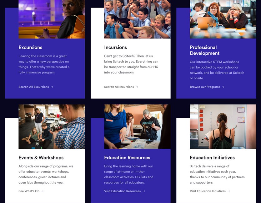
A common accessibility issue is the use of descriptions such as ‘click here’ or ‘read more’ which are difficult for screen reader users as it’s not clear what the ‘click here’ or ‘read more’ will do. Taking this feedback on board, Scitech worked to ensure their links are more descriptive so that it’s now clear what links will do if selected.
Colour contrast
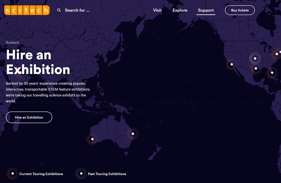
A common accessibility issue that can creep in during development is issues
relating to colour contrast. This may be through the use of colour alone to
identify a change which makes it difficult for people with a colour vision
impairment, or poor contrast overall. While the Scitech website prior to launch had considered contrast, there were some elements where colour alone was used and other sections where the recommended 4.5:1 colour contrast ratio had dipped in places. Taking the feedback on board, Scitech rectified the the issues ensuring that the website has an excellent use of colour.
Form fields
In the initial review, there were some form fields such as the Search box which were difficult for assistive technology users to pick up. This issue was easily addressed, and the search box now works well.
Mobile Orientation
Another issue that was identified in the accessibility assessment and testing related to screen orientation whereby some elements would not view correctly in both portrait mode and landscape mode. This would mean that if a person had their mobile device mounted in a particular position, there would be aspects of the website that didn’t function correctly. Scitech worked with their developers to address this issue and the website now works great in both portrait and landscape modes.
With the new Scitech website now live, it’s great to see that its accessibility journey is largely complete with ongoing vigilance from its development and content teams to ensure that accessibility issues don’t creep back in.
Many thanks to Scitech for the opportunity to provide the assessment.
